Kelly Wooldridge
Labels
- Unit 2 C1 (4)
- unit 2 C3 (2)
- Unit 2 c4 (4)
- Unit 32 C1 (1)
- unit 32 c3 (3)
- Unit 32 C4 (5)
- Unit 54 C1 (2)
- Unit 54 c3 (8)
- Unit32 C2 (1)
Tuesday, 19 July 2011
Monday, 18 July 2011
Final Desgin of shred

this is my final desgin for shred; as you can see i have stayed with the same font on this logo aswell this now shows that all three of my logos have the same font type which is one of the aspects which will marry them into a 'family' of logo's. the same as before when i was making this logo i again thought about the target audience and the sorts of colours i would need to use to make them intrested in this radio station. i also needed to think about the background again on this logo as i needed to make it fit in with the name of the station so i decided to use a green explosion like tool to go in the background. i believed that this would show angry and shred! as its big and looks out of control.
overall i believe that this logo will be successful in the radio business as it is eye catching and eople will want to know more about this radio station and also the other two, which would them help all three radio station get the promotion which they need. again this radio station will have the merchidise to go with it and would have the same tyes as the other two logos.
www:
I believe that i have made this logo represent the type of people i want to have listening to radio station, the colours which i would of used would also relate to the target audience and would be bright enough to grab there attention with the colour.
The green behind the writing is a good effect and makes the writing seem like its poped out.
ebi:
the green was a little brighter and would therefore make the writing come out even more and grab the audience attention.
final desgin of Pulse

This is my final desgin of pulse; as you can see i have stayed with the same font type as i had for the logo 'BUZZ'. i thought this would help marry all of the logo's together and make them seem more of a 'family'. when making this logo i thought about the colours which i could use to make them appeal to the target audience more! i also needed to have something in the background this is where the paint spolges come into the desgin i thought that it has a jazzed up edging and would maybe look like it was pulsing.. i also thought that it could also represent the music.. as the music plays they move in and out in a pulsing fashion.
overall i believe that this logo will be successful in the radio business; as it is eye catching and people will want to know more about what'pulse' is. i would also create a wide range of merchindise like i did for the buzz logo to help promote the radio station and then would end bring all logos together now and again to show that they area family and come from the same produces
www:
the colours i used go well together and reach out to this radio stations target audience
the font matches the rest of the logo's so this makes them look like a family
ebi:
the background makes no sense to the word pulse and wouldnt be a typical thing you put as the background
Friday, 8 July 2011
Feedback for logo's
 During one of my lessons i decided that i would get feedback from other members of my class on what they think of the three different logo's which i had designed for the free different radio station, i gained both positive feedback as well as negative feedback. some points which my peers had made was:
Friday, 1 July 2011
Final Designs: Buzz


 this is the male design for with the buzz logo on; as you
Making of Pulse
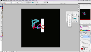
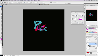
When i first open photoshop i needed to create a new document; i decided to make the page a A4 side as i wasn't sure how much room the logo would take up. i decided on two colours for this logo; these being Blue, purple and pink. again i have decided to stay with the same font as the other two, being never writer. again i will be making my own arrows and extra stamps to put on the font to make it look more like the logo's which i had designed on the planning sheets.
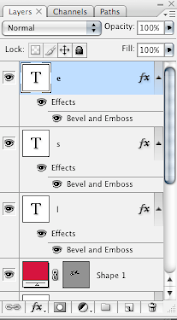
 I have already started to use the different layers for all of the different letters and background.
Each letter on the page has its own layer as i wanted to be able to move the around to make it more jazzed up and then also would be able to change the colour of the letter and also then would be able to open up the layer style box to make changes and edit it through there.


Making of Shred
As i wanted all of my logos to look like there from the same 'family' i decided that i would keep the font the same. therefore i would not need to go and look for a different font which would fit into the family. so again i decided i would use
 the never writer font type and then add my own effects to the fonts by the stamp tool which would then lead my final piece of work to look like the piece which i planned.
As you can see
from this screen capture i have got a number of different layers, which i would be able to use and exprientmemnt with to see how i could maybe improve my idea from what it looks like on paper to what it looked like on the screen. In this screen shot i decided that i would want to click on the layer which is linked to the image which i behind the letters which make up the word sherd. now that i have all of the different layers when i click on a certain layer i will only be able to move, edit and delete the layer without making any changes to the other layers, which would then be able to stay the same.As i was already on the option to change and edit the explosion in the background. i thought i would be able to edit some of the colours in the layer style.

This screen shot involves a the layer style box, this box appears when you double click on the layer which you wish to edit. before i had the explosion in the background a green colour however i wanted to see what it would look like as a more metal like colour. so i decided to change it too see whether i would like it as much or not. however i decided that i would stick with the green colour as it brought the red and yellow more to life and would make the whole logo stand out more.
next i decided to add more of an effect to the 'S' at the beginning of shred. i wanted it be as eye catching as possible

so it would grab the target demographic of this radio station. over all by trying to make it stand out alot more i added bevel and emboss effect of contour and also stroke. This meant that i was then able to add a outer glow in a lighter shade of red than the colour inside of the 'S'
After looking at the i decided that i wasn't sure about the way the green over laid the bottom of the 'S' and covered the colour so i decided i would want the green too be behind the letters.

To make the green go behind the red i decided that i would drag the symbol layer to underneath the text layer for the 'S'. this would then allow the 'S' to be at the top of the green explosion. you can see this in the photo as the bottom of the 'S' has go s few yellow lines over, however i liked this effect as i thought it would tie in well with having the yellow font as well as the the yellow as a overlay.