Tuesday, 14 June 2011

Planning The Logo's

Ow! music is launching six new radio stations later on this year; and asked me to create three different logo for one of there six radio station; the names of these six radio stations are; Lock, Pulse, Mixx, Buzz, shred and VIP; i picked the free radio stations which went by the names of; Buzz, Shred and Pulse. They wanted the three radio stations to look like a 'family'. We had to take into consideration that these logo's will be appearing on letterheads, on the home page of the radio stations homepage, magazines, billboards and also a wide variety of merchandise. When thinking about the type of aspects which we would want our radio stations logo's to include would be; the target audience and demographic, who would be listening to the music on this certain radio station, this would then lead onto the the question of what type of music would this certain radio station be playing. This is were i needed to think carefully about the types of colours and fonts which i will be using and what colours and font would grab our target audience attention, and would also make these radio stations successful.

When we started to plan our work we had to make sure that we had a number of different options which we could pick. With making sure that they are all in the same family.

My first idea, was the 'arrow' idea. This consist of them each letter of the logo would have a arrow coming of it somehow, this is one of the main reasons i chose the three radio stations which i did as the lettering in the words were ones which had some straight edges; which would allow me to carry out my idea and have arrows on each letter.
I also wanted to make the background of the logo look more colourful; so i had to think about the different types of pictures which could relate to the certain words.

is my three different ideas about my three chosen radio stations; as you can see that each of these are different colours and all have a different background apart from the background on buzz. when looking at all three of these logo when they are put together you can see where they are linking into each other. i have decided to put a 'pulse rate' behind the logo for the radio station called pulse; this is because it thought its reinforcing the name of the radio station, and also that i thought that new upcoming music could be featured on this radio station so it could also annotate there pulse rate and how there feeling when there music is being played. When looking at the sherd option i have put the background as if something was being ripped to pieces and also like an explosion. This is also to reinforce the name of the radio station but also to represent the music which is being played on this radio station. i aim to have more heavy mental, rock, punk, scene music playing on this radio station, and lastly i chose buzz to have popular chart music playing as it could give you a 'buzz' from listening to them. when you are out at partys or clubbing having a 'buzz'ing atmosphere. so i thought all of that linked in nicely with the name of the radio station.

my other option didnt really look like a family; this is my second set of idea's:
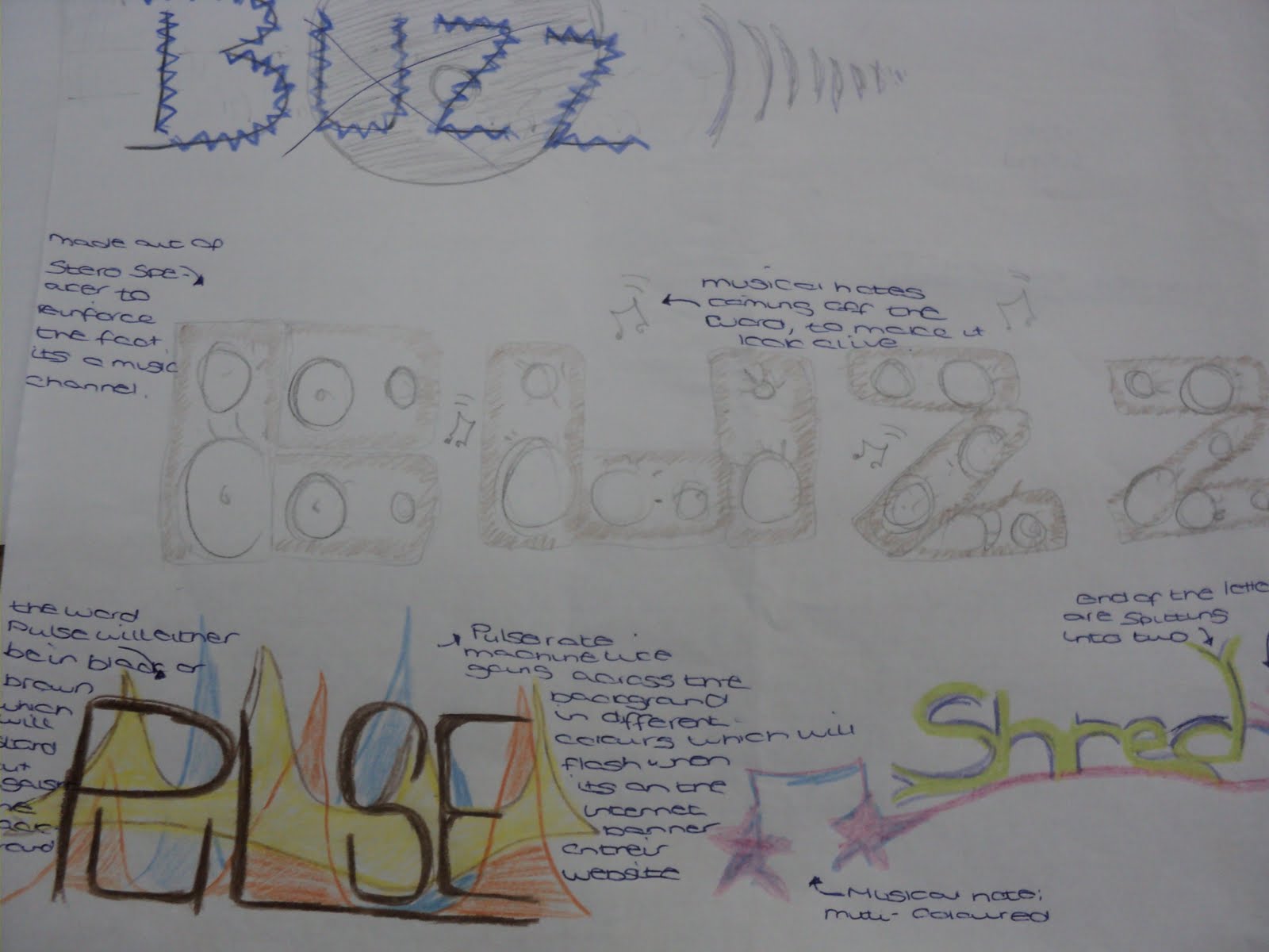
This is my second ideas as you can see that they do not link as well as the others did as a family. i tried buzz out by making each line of each letter would be a speaker. i thought this would link in well which the whole point of it being a radio station. however i believe that this would look rather tacky and not really reach out to the radio stations target demography, and would possibly only have a niche audience, the total opposite to what we wanted. the pulse logo; i still stuck with the straight writing with the multi-coloured background however i decided that i didn't really like this idea as much as i did the first ones. when i made the idea for number 2 of shred, i really liked my idea and believe that this could be better than the shred on the first idea. i personally like the idea of the the line underneath shredding into two lines and also the way it links to a musical note.

once ive complete these two different i got another sheet of paper; and made notes about who the competition was for these radio station; i also used a number of different words and phrase to try and get more idea's i decided on the target audience in these notes; and also the types of music which these types of radio stations would have.

Making Of The Buzz Logo

Ow! music is launching six new radio stations later on this year; and asked me to create three different logo for one of there six radio station; the names of these six radio stations are; Lock, Pulse, Mixx, Buzz, shred and VIP; i picked the free radio stations which went by the names of; Buzz, Shred and Pulse. Within this blog enter i will be creating the first logo out of the free this one is for the radio station which goes by the name of Buzz.
When i first open photoshop i needed to create a new document; i decided to make the page a A4 side as i wasn't sure how much room the logo would take up. i decided on two colours for this logo; these being White and Green.
i had also had to think of the right kind of font for these family of logos; i wanted to find one which was as closest to the font which i had designed on the planning sheets, however i couldn't find fonts like this on the websites which i used (da-font and 1001fonts) however i did come across one which i believed would work, if i added the arrows myself. it would then start to look like the fonts which i wanted it too on the planning.

the font which i chose is called: neverwriter
once if downloaded the font to the mac computer i then decided that i would then write Buzz, however because i wanted to have the letters at different points on the page, i had to make them on separate layers. i then started to add effect onto the lettering and also the arrows and stars which i had added to the logo.

The first thing i decided on was too add another colour to the logo so it would make it more less manly and make it more of a unisex radio station therefore i decided to use the stroke effect and add a pinkish outline to the last two letters on the logo and also to make it stand out more. i decided that i wanted to make it three colours as i believed that this would make the logo more eye catching aswell, also when you say the word 'buzz' you hear the 'zz' more than the rest of the letters and also this makes it sound like what its went to be doing.

Then i decided to muck around with the B on the logo as decided to see if it would look any good with a pattern overlay; i decided that the best pattern overlay would of been the optical checkerboard, however when i looked at it on the actual logo i decided that it didnt fit in well with the whole theme behind this logo and wouldn't really reach out to our target audience; i think that it could of looked alot better if i had taken down the opacity as when it is showing us the example it is at 100%.
i wanted too see if adding another effect to the 'Z' in the logo would make it look any better' i believe that i made the right decision; when i chose not to add this effect into the logo i went through the artistic, brush strokes; and sketch effect and none of them really fitting in with the rest of the logo. it would of also removed some of the colour which i didn't want as i believe that the colour was the main part of getting the mass audience which the radio station wants.


After taking a look at the logo so far i decided that i would want to make the arrows coming from both ends of the logo was the colours of the letters as this would make it look more professional. i also wanted the arrows to stand out more; so i decided to make it a solid colour.

TBC!

Tuesday, 24 May 2011

File Format Help Sheet

Graphic File Formats Kelly Wooldridge

Tuesday, 22 March 2011

the grid animation TV ident


Theses are three of the other ideas of what we were planning to do; we wanted to stick to the theme of a rubiks cube and all of the different colours on the rubiks cube as this will help us relate to our target audience of 18-30 year olds.

This is the first idea; we have chosen to use stop animation as the main feature in this TV ident, and use a normal still digital camera. this

we have chosen to have a bit of film within the ident at the beginning of it; this would consist of as track in, track out shots to show the rubiks cube and where it is.means that in every second there will be 12 frames therefore there will be over 300 frames

if we wanted to have the full 30 seconds full of animation.

as this is animation we will not need to have make up or costumes, as the only things which you will see in the shot is the rubiks cube so this would be our only prop.


Final Cut: Putting IMovie and Live Type Together.

to combine my live type titles and ident which is in IMovie, i needed to transfer both pieces of work onto final cut, where i would be able to overlay the titles over my tv ident for the grid.

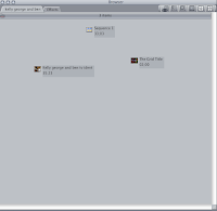
Firstly i needed to export both of the pieces of words; into one place, i chose to save these exported files into the video work folder which is on the desktop. After this i dragged both of the files into the bowser window where i was able to view both of the files together in the two viewers, and we could see and decided on how

we want the final ident to look like once we had decided on how we wanted our final ident to look like we moved both of the files into the time line were we was able to combine both.

Once we had put the livetype file other imovie we were able to render the movie together and export it as the final copy; and save it into the handing in folder.

at the end of our session on final cut this is what we ended up with:

Tuesday, 15 March 2011


these story boards and locations pictures are for the TV ident called 'Griddy Boy' we have based this ident on the rubiks cube as it relates to the grid in a clever way as it rep
The storyboard above has been broken down into 4 sections so you can see a clearer description of what is going on. This ident idea also relates to The Grid in a clever way as it is represented through a rubix cube. In the above storyboard, 'Griddy Boy', the superhero, flies into Grid land to complete the dreaded rubix cube. With his reputation he completes the rubix cube with a variety of shots showing us this. After he has completed it the whole town congratulate him and he receives a certificate which has 'The Grid' on it.
This is a clever alternative ident idea as it relates to the current ident as at the minute no-one can complete and then a super hero comes along and saves the day. Its also creative as the rubix cube relates to the grid so there is relevance behind the idea. Its also keeps the viewer hooked as they want to find out whether the superhero completes his task.
There is a variety of shots being used in this ident such as an over the shoulder shot, and extreme long shot which keep the viewer interested in the ident as the camera is constantly changing and the mise-en-scene is continuously changing aswell.
Additionally the shooting schedule shows where our ident was going to be filmed, what costumes we would have needed and what props were going to be used, the actors and crew members involved.

Location
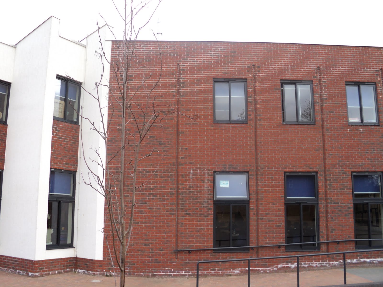
We chose these locations as the mac computer in a media room is the perfect location to film our fake TV report. The double doors outside the Jubilee wing was choose to film the end of the ident when 'Griddy Boy' receives his certificate for completing the rubix cube. An area with nothing in it was ideal for us to film the crowd for the ceremony at the end as he could fit a number of people in it and there was enough room in it to see them celebrating. The jubilee building itself was good as we are going to use it as a background for our animation of 'Griddy Boy' flying past buildings on his was to the rubix cube. A normal media room was chosen for the filming of the rubix cube as it continues the location from the previous ident (puzzle)

On Screen Graphics:

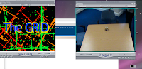
George was in charge of creating the titles for our ident so in order to relate the titles to 'The Grid' he downloaded a variety of fonts that resembled a grid, a box format, once he managed to get these into livetype he then chose the one i thought had the greatest effect and selected it. I believed that it was 'Grapple BRK' as it was a square format. However, when downloading this i found some issues as every new computer i was on, i found that i had to download it again. I didn't know this at the time so when we watched our titles and they weren't working it was both frustrating and confusing. After i had 'The Grid' typed out in the selected font, i found a background effect that looked like a grid. I then selected it 3 times and put it in different positions and different colours to create a brighter and more vibrant background. The titles and the background effects all included the colours of the rubix cube (red, green, yellow, orange, blue, white) which showed creativity and relevance to our titles.